
Copilot for Microsoft 365 Adds Data and Summaries in Excel, Enhancing Visual Content
-
 11 February 2024
 Sales and Billing
-
 Written by
Justin Greaves
Written by
Justin Greaves
We have an Excel spreadsheet containing information about our company, including gender, age, ethnicity, and quarterly sales. Our goal is to:
- Add Quarterly Sales Figures
- Create a Chart for Revenue Growth
-
Adding Quarterly Sales Numbers
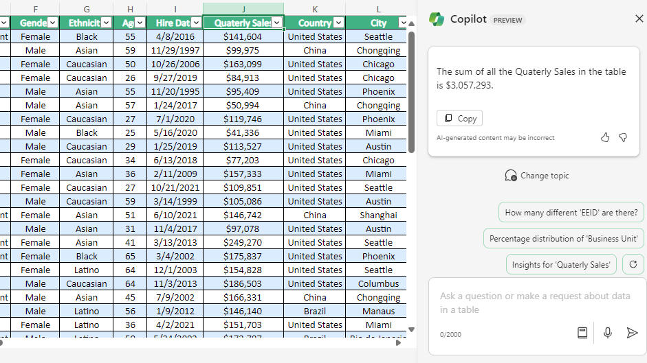
Open the spreadsheet containing company personnel info. Launch Copilot and prompt it with “Add Quarterly sales.” Here’s the summary Copilot generates:
“The sum of all Quarterly Sales in the table is $3,057,293.” See the attached screenshot.
 Besides adding data in Copilot, we can also pose questions, such as requesting Quarterly sales data specific to gender (Male or Female).
 -
Enhancing Visual Content
Instruct Copilot in Excel to create a chart depicting revenue growth over time. Use the prompt “To form a chart for the overall spreadsheet.” Copilot’s response is:
“The result is a chart displaying total revenue growth for each department. Is there anything else you would like to know?” The visual outcome is presented below.
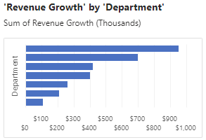
Thus, the revenue graph offers valuable insights into a company’s financial performance over a specific period. It clearly illustrates revenue trends and variations, facilitating a quick and thorough assessment of the company’s financial health.